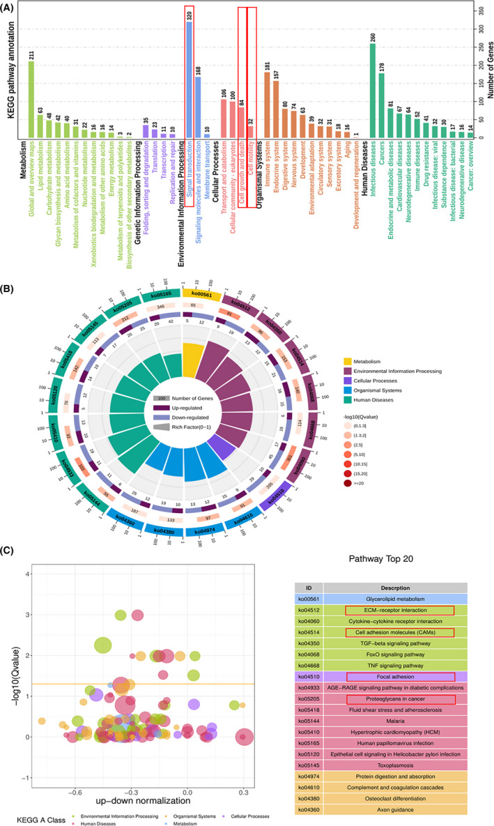
FIGURE 8.

KEGG pathway enrichment analyses between normal and PDRG1 knockdown groups. RNA‐Seq analysis from normal and PDRG1 knockdown U118 cells was performed. A, Enriched circle map showing the KEGG PATHWAY. B, The z‐score bubble chart represents the top 20 enriched KEGG pathways. The x axis shows the −log10 (Q value) and the ratio of up‐down normalization. The yellow line represents the threshold of Q value (0.05). Different colors represent different classes. C, KEGG pathway enrichment analyses show pathways under five classes including the number of genes
