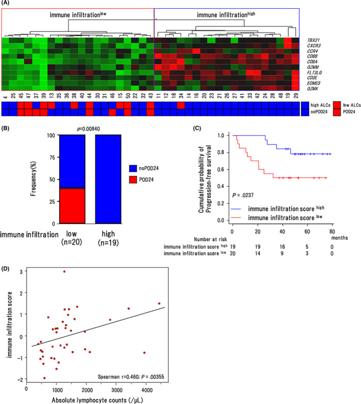
FIGURE 6.

Association of the immune infiltration score with clinical outcomes. A, Heat map and unsupervised hierarchical clustering showing the genes along rows and cases along columns in the nOR group. Green denotes low and red indicates high gene expression. The regions indicate the low (shown in red) and high immune infiltration cluster (shown in blue). B, The proportion of cases with POD24 in the infillow and infilhigh clusters in the nOR group. P‐values by Fisher exact test are shown in the graphs (n = 39). C, Progression‐free survival of cases in the IISlow (n = 20) and IIShigh (n = 19) groups in the nOR group (n = 39). Log‐rank P‐values are shown in the graphs. D, Scattergram shows the correlation between ALCs (horizontal axis) and IIS (vertical axis). Spearman's correlation coefficients are estimated as continuous variables
