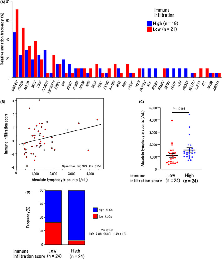
FIGURE 7.

Association of the T‐cell‐associated gene expression with their mutation profile. A, Mutation frequencies of recurrently mutated genes by infillow and infilhigh clusters in all cases (n = 40). B, Scattergram shows the correlation between ALCs (horizontal axis) and IIS (vertical axis). Spearman correlation coefficients were estimated as continuous variables. C, The number of ALCs in the IISlow (n = 24) and IIShigh (n = 24) groups. P‐values using Wilcoxon rank sum test are shown in the graphs. The graph shows the mean and SEM of data from the cases in the respective groups. D, The proportion of cases with low ALCs (< 869/μL) in the IISlow (n = 24) and IIShigh (n = 24) groups. P‐values using Fisher exact test are shown in the graphs
