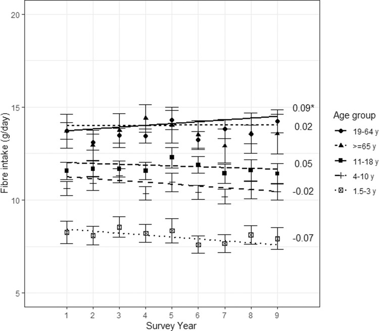
Fig. 1. Trend in mean fibre intake of the UK population between 2008/09 and 2016/17, by age group.
The graph shows mean fibre intake and 95% confidence intervals for each age group and each survey year of the NDNS. Trendlines were plotted for each age group. Corresponding estimates for the time trends are shown on the right of the graph (corresponding to the interaction term between survey year and age group). Asterisks (*) indicates a significant estimate at a 5% level.

