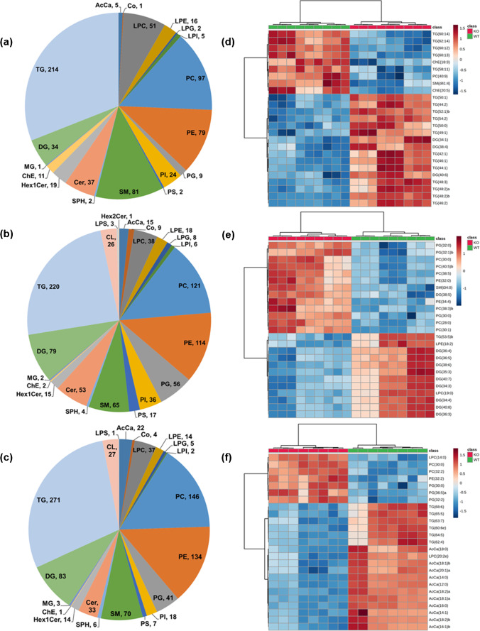
Fig. 2.
Overview of the global lipidomics analysis. Pie charts depict the summary as well as distribution patterns of identified lipid species/classes among all the tested biological specimens a serum, b liver, and c heart tissue homogenates. The numbers in pie charts represent the number of lipid species confidently identified and quantified in a particular lipid class. Heatmap illustration of lipid species between Pex11α knockout (KO; Pex11α−/−) and wild type (WT; Pex11α+/+) control mouse d serum, e liver, and f heart tissue homogenates. Data in heatmaps is based on z-scores for the normalized, transformed, and scaled data. The top 25 differentially abundant lipid species (with lowest FDR-adjusted p-values) were ranked based on t-test, distance was measured using the Euclidean correlation, and clustering was performed using the Ward algorithm

