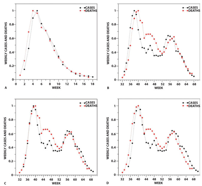
Figure 2.

Comparison of the evolution of the weekly cases (black) and deaths (red) upon normalization of the curves in (A) Phase 1 (W1-W17) and (B-D) Phase 2 (W32-W67) of the pandemic. The normalization was performed by dividing the actual values by the maximum of each ensemble. The curve of cases is 1-week (A, B), 2-week (C), 3-week (D) shifted ahead.
