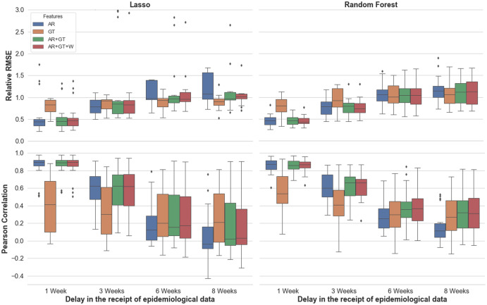
Fig 1. Performance across cities, as measured by Pearson Correlation and Relative RMSE.
The colour of each box indicates the feature set used, and the x-axis notes the assumed delays in the receipt of epidemiological information. Each box shows the interquartile range of the metric for a given set-up (of feature set, assumed delay, and underlying model), while the whiskers show the rest of the distribution. Points beyond the whiskers in either direction are determined to be outliers.

