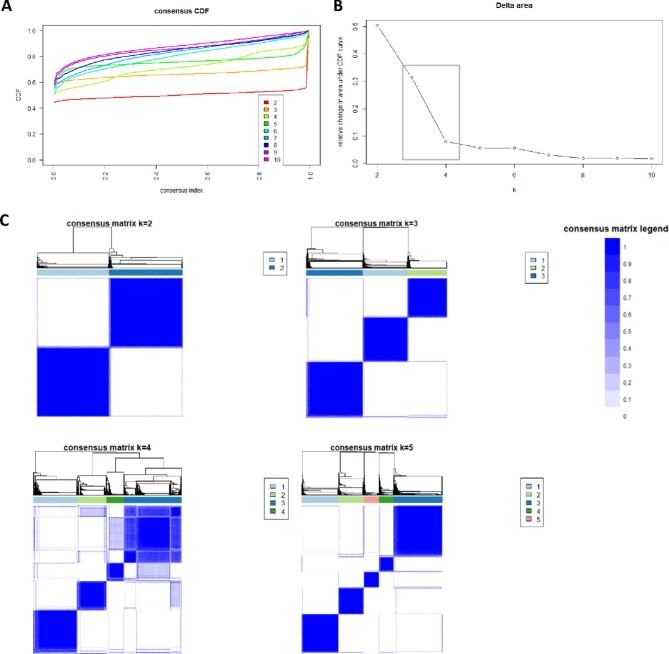
FIGURE 1:
(A) CDF plot displaying consensus distributions for each number of clusters (k). (B) Delta area plot reflecting the relative changes in the area under the CDF curve. (C) Consensus matrix heat map depicting consensus values on a white to blue color scale of each cluster. The square demonstrates largest changes in area occurred between k = 3 and k = 4.

