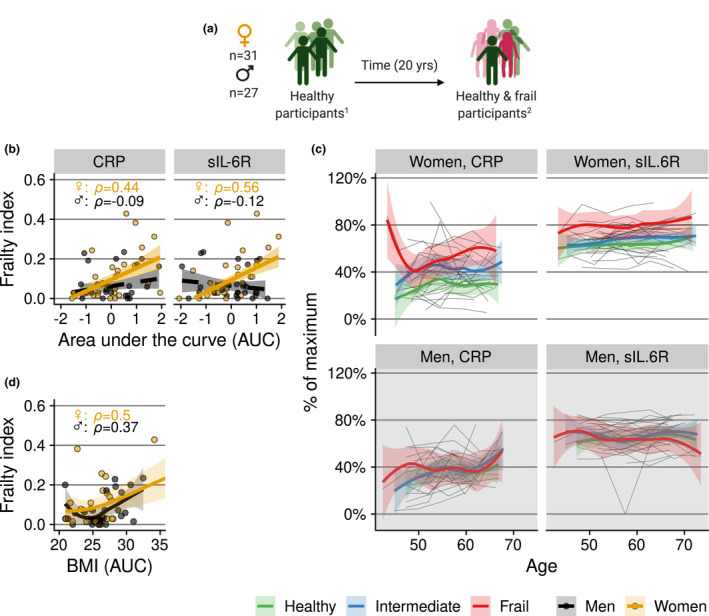
Figure 6.

(a) Subgroup of selected participants who were ‘healthy’ at baseline. 1Health status at baseline was defined by a healthy ageing index (‘healthy’ taken to be a score of 9 or 10 out of 10). 2 Health status at the endpoint was defined by a frailty index score. (b, c) Relation of frailty at the study endpoint with trajectories of CRP and sIL‐6R in the subgroup of people who were ‘healthy’ at study baseline. To capture the cumulative ‘exposure’, trajectories of CRP and sIL‐6R in (b) and of BMI in (d) are expressed as the area under the concentration/BMI versus time curve per individual. Grey lines in (c) are individual trajectories. Bold coloured lines in (b) are (robust) linear regression lines, and in (c) and (d), local polynomial regression lines with 95% confidence intervals. In (c), the colour denotes the ‘frailty category’ at the study endpoint. Frailty categories are used for visualisation of the longitudinal trajectory; for the statistical analyses, the continuous frailty index score was used. Concentrations in (c) are scaled to percentage of maximum concentration per marker.
