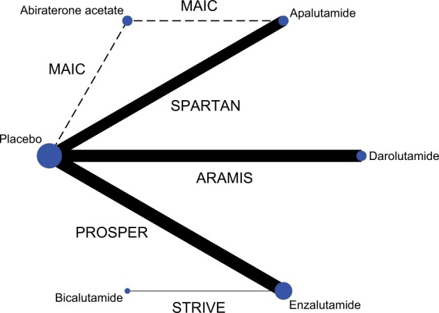
Figure 1.

Network graph of treatment comparison. The figure depicts the underlying evidence base of this study. Circles represent competing treatments; solid lines show which treatments have been compared in randomized controlled trials; and the dashed line denotes matching-adjusted indirect comparison (MAIC). The circle size is proportional to the number of trials evaluating each treatment; and the line thickness is proportional to the precision (the inverse of the variance of hazard ratios of metastasis or death estimated from metastasis-free survival) of each comparison. The labels on the lines are trial names.
