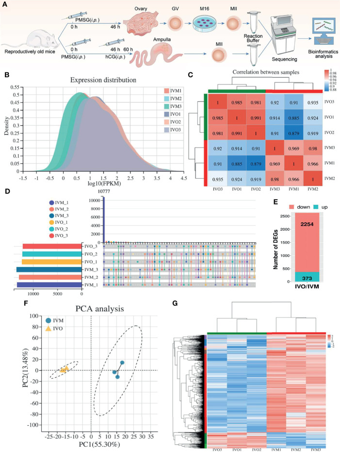
Figure 1.
DEG analysis between IVO and IVM groups. (A) A schematic showing experimental design and time points. (B) Gene expression density distribution in the IVO and IVM groups. (C) Correlation analysis between the IVM and IVO groups. The degree of correlation is represented by different colors. (D) An UpSet plot summarizing the genes detected in the six groups. (E) A stacked column showing the numbers of DEGs in the IVO group compared with the IVM group. (F) PCA of gene expression profiles in oocytes between the IVM group (blue dots) and the IVO group (yellow triangles). (G) Heatmap showing DEGs; the red rows represent high expression levels and blue rows represent low expression levels. Each column represents an independent sample.

