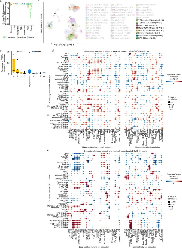
Extended Data Fig. 7. Immune cell population dynamics.
(a) Fractions of unique BCR sequences show the differences in immune repertoire diversity over age and disease. (b) UMAP visualization as in Fig. 3a showing the annotated interferon-stimulated subpopulations in clusters 35−42. (c) Boxplot showing the percentage of PBMCs that are interferon-stimulated in asymptomatic or symptomatic COVID-19 patients, grouped by the weeks since the onset of symptoms, and separated for adults (left) and children (right).(d) Dotplot of Spearman correlations between nasal and blood cell type proportions in paediatric COVID-19 patients and (e) in adult COVID-19 patients. In both d and e, cell type proportions in the nose (x-axis) are compared to the blood (y-axis). Correlations shown in Fig. 3g present a zoom in of the adult panel. Rows and columns in both dotplots are clustered by hierarchical clustering on the combined matrices. The size of the dots is scaled by the significance of each correlation. Colour is scaled by the Spearman rank-correlation coefficient. If a blood - nose cell type combination shows a positive correlation, this is indicative that if the blood cell type changes in proportion, the nasal cell type changes accordingly, and vice versa. Dots in a and c represent independent patient samples. Box plots were drawn with the centre line as the median of the data distribution, the hinges as the first and third quartiles, and with the whiskers extending to the lowest and highest values that were within 1.5 × interquartile range of the upper or the lower hinge.

