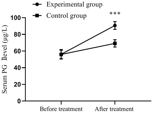
Figure 2.

Comparison of serum PG I levels in patients (x̅±sd, μg/L). Note: The horizontal axis from left to right represents before and after treatment, and the vertical axis is serum PG I level (μg/L). The dotted line represents the experimental group, and the square line represents the control group. *** indicates P<0.001, experimental group vs. control group by two independent sample t-test.
