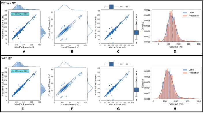
Figure 8.
The top row shows (A) the regression plot and (B) the kernel density estimate plot along the two variables (label volume and predicted volume) marginal distributions. It also shows (C) the regression plot along the two variables' boxplots and (D) the kernel density estimate and histogram plots of the variables with the dashed vertical lines representing the arithmetic mean of the distributions. The symbols ρ and p represent the p-value and Pearson correlation coefficient, respectively. The plots (A–D) correspond to the label volumes vs. the predicted volumes without quality control (QC) and the plots (E–H) correspond to these variables using the proposed QC framework.

