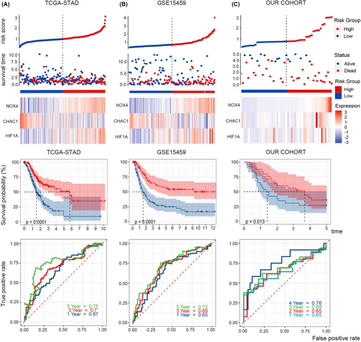
FIGURE 3.

Survival and ROC analysis. Risk score distribution, survival overview, heatmap of key genes, Kaplan‐Meier overall survival curves and time‐dependent ROC curves in TCGA (A), GSE15459 (B), and our cohort (C). As the risk score increased, more patients died
