Figure 4. .
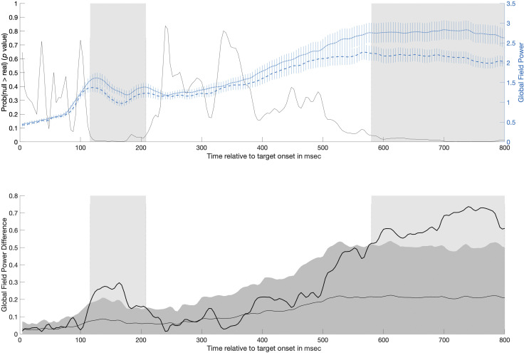
The top plot shows mean GFP (right y-axis) over time for both pretest (short dashed line) and posttest (long dashed line; error bars show ±1 SE) in the generalized learning condition overlaid on the probability over time that the GFP difference under the null was larger than the observed difference in GFP (black line; left y-axis). Significant time periods identified by the GFP analysis are shaded gray: one occurring from 116 to 208 msec and another occurring from 580 to 800 msec. The bottom plot shows the difference in GFP between pretest and posttest (dark black line). For context, the mean (light gray line) and 95% CI (dark gray area) for the GFP difference expected due to random chance (estimated from randomizing the data 5000 times) has been plotted. Significant time periods are again shaded gray, although note that these periods are identified by the observed difference in GFP exceeding the upper bound of the 95% CI of the shuffled data.

