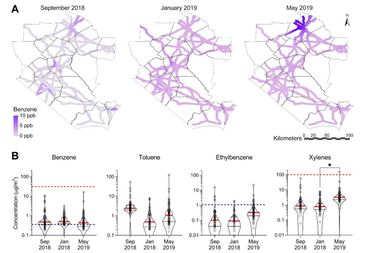
Figure 2.
Spatiotemporal distribution and concentrations of BTEX along the major roadways in the study area. (A) Kriged maps showing spatial distribution of benzene for three sampling campaigns. Color gradients (see inset) show concentrations. See Supplemental Figures S2–S4 for the distribution of other VOCs. (B) Violin plots showing temporal distribution of BTEX concentrations for three sampling campaigns (red thick line = median; thin black lines = quartiles, dots = individual sample data) in comparison to screening levels (red dashed line = non-cancer; blue dashed line = cancer) for each pollutant. If no line is shown on a chart, the screening value has not been established or the screening value is greater than the range of data points shown. The asterisk (*) denotes statistically significantly different (p < 0.05) by one-way ANOVA followed by Tukey’s multiple comparison tests.

