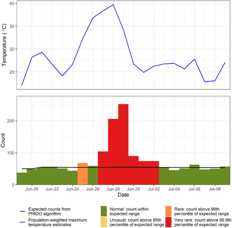
Figure 1.
Time series of daily observed mortality (bars) and daily population-weighted maximum temperature (blue line) estimates for greater Vancouver during the 2021 heat dome. Counts are coloured according to their deviation from expected values (black line), as calculated with the PHIDO algorithm used by the BC Centre for Disease Control. Heat dome deaths were drawn from the 6 days coloured in red, which include June 27 through July 2. PHIDO, Public Health Intelligence for Disease Outbreaks.

