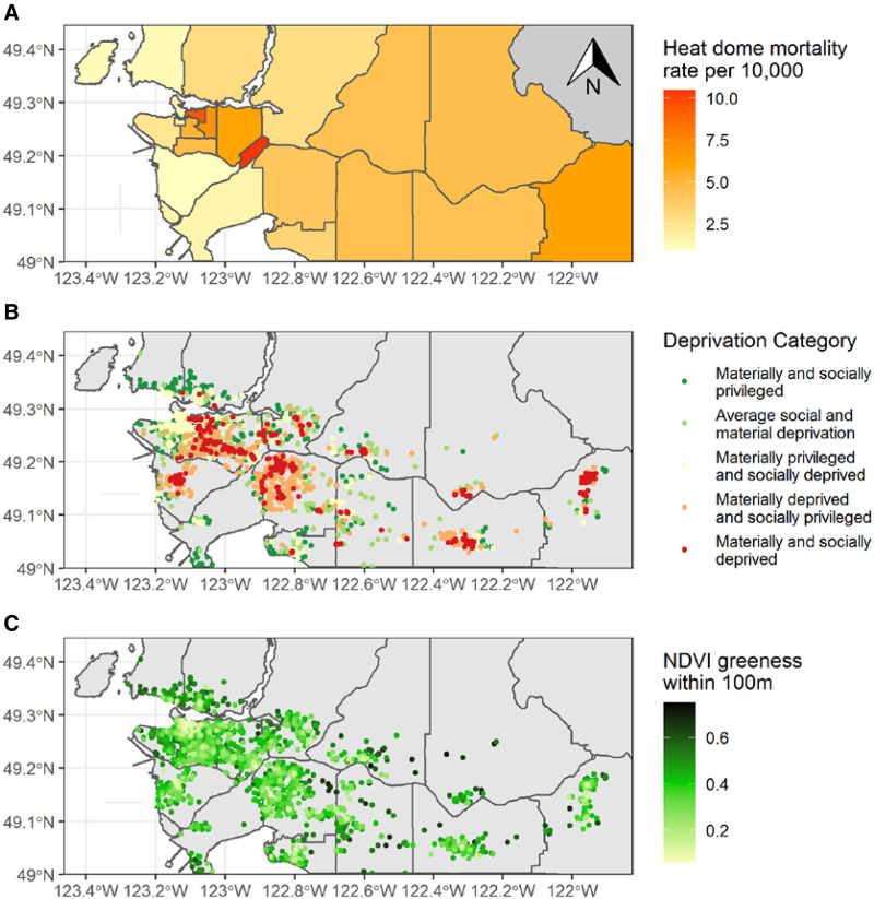
Figure 3.
Maps of the heat dome community mortality rate (A), locations in the material and social deprivation categories (B), and greenness within 100 m (C). The crude mortality rate is shown for those aged 50+ in each of the 20 local health areas included in the study. Deprivation categories are shown at the postal code locations for all deaths included in the study, whether they occurred during the heat dome or the typical weather period. Likewise, the NDVI greenness values are shown at the postal code locations of all study subjects. NDVI, normalized difference vegetation index.

