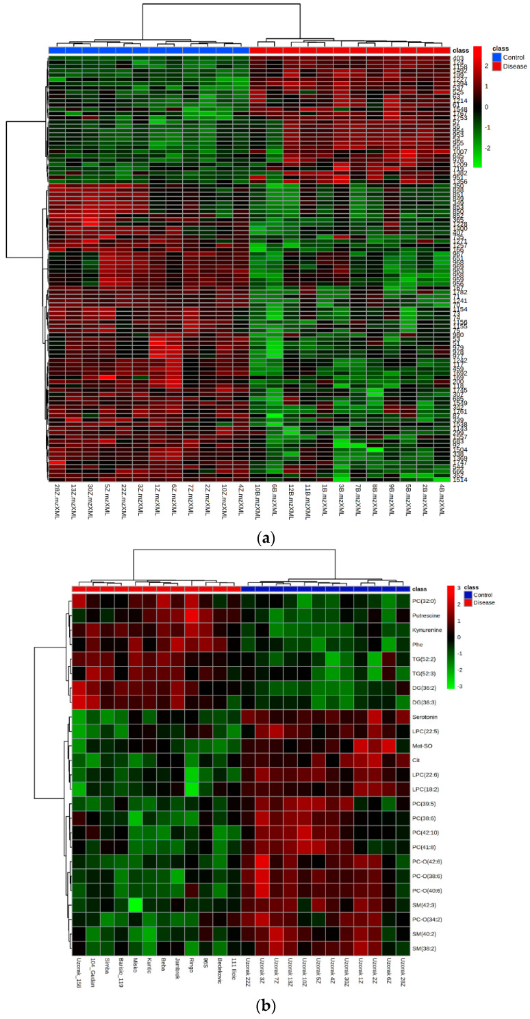
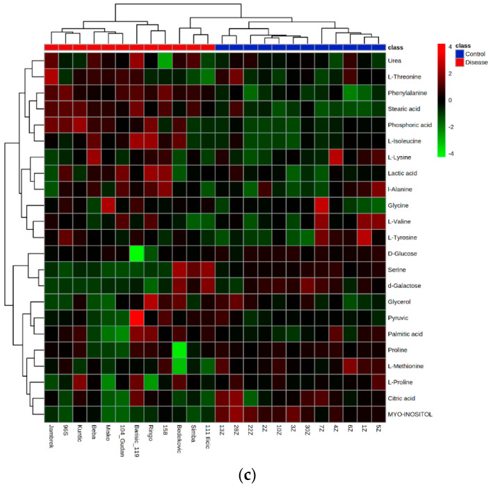
Figure 6.
The heat map of the metabolic features in the untargeted LC-MS metabolomics (a), targeted LC-MS metabolomics (b), and GC-MS metabolomics (c). Red color represents the increased level of each metabolite, while blue color represents the decreased level of each metabolite in dogs infected with B. canis versus control dogs. Blue panel-control samples, red panel-disease samples.


