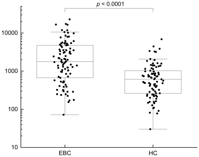
Fig. 2.

Plasmatic EVs level measured in BC (n = 95) and HC (n = 86). Data are shown as box and whisker plots. Each data point represents an individual subject analysed. Each box represents the area between the 25th and 75th percentiles [interquartile range, IQR]. Lines inside the boxes represent the median values. White dots represent the mean value for each class. Whiskers extend to the lowest and highest values within 1.5 times the IQR from the box (a)
