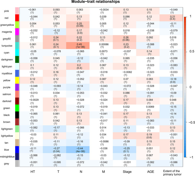
Figure 5.
Heatmap of module-trait relationships. Each row corresponds to a module, and each column corresponds to a trait. The progressively increase in blue and red saturation indicated a high Pearson’s correlation coefficient. The numbers in the squares indicate Pearson’s correlation coefficients.

