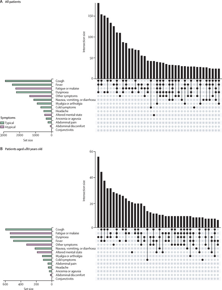
Figure 4.
Presenting symptoms of COVID-19 among older adults with cancer
UpSet plot indicating intersection between symptoms in older adults with cancer in a matrix layout. The bar graph in the lower left corner depicts symptom-level distribution across each category (typical or atypical). Each row in the dot graph represents a symptom classification; solid dots represent each symptom part of the intersecting sets. The centre bar graph depicts the number of symptoms in each intersection.

