Figure 1.


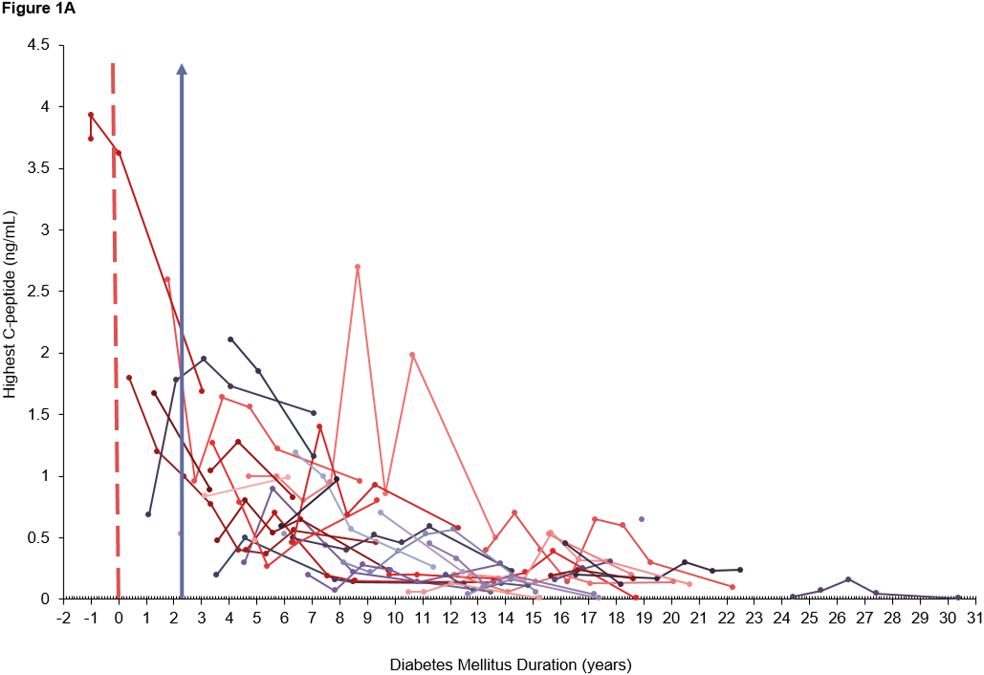
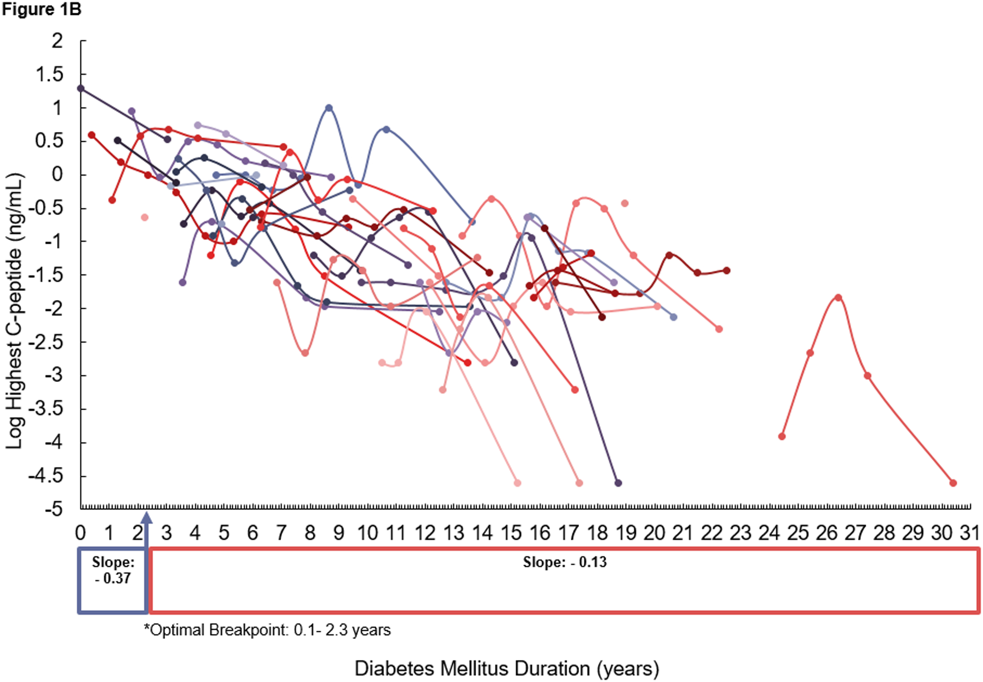
Scatterplot of A) raw data for peak C-peptide and B) log-transformed data for peak C-peptide, over time (measured as diabetes duration at current clinic) in patients with diabetes mellitus. Each trajectory profile represents an individual participant’s peak C-peptide levels over time. Each dot represents an individual data point for peak C-peptide measured at a participant’s clinic visit with a line connecting data points for that participant over the duration of their diabetes mellitus. A) The dashed red line represents the time point at which diabetes began. The data to the left of the red line represents C-peptide levels for the participant who developed diabetes mellitus during the study. Pre-diabetes mellitus diagnosis data was not included in the random coefficients model. A&B) The purple arrow represents the optimal breakpoint (2.3 years) at which the slope for C-peptide decline changes.
