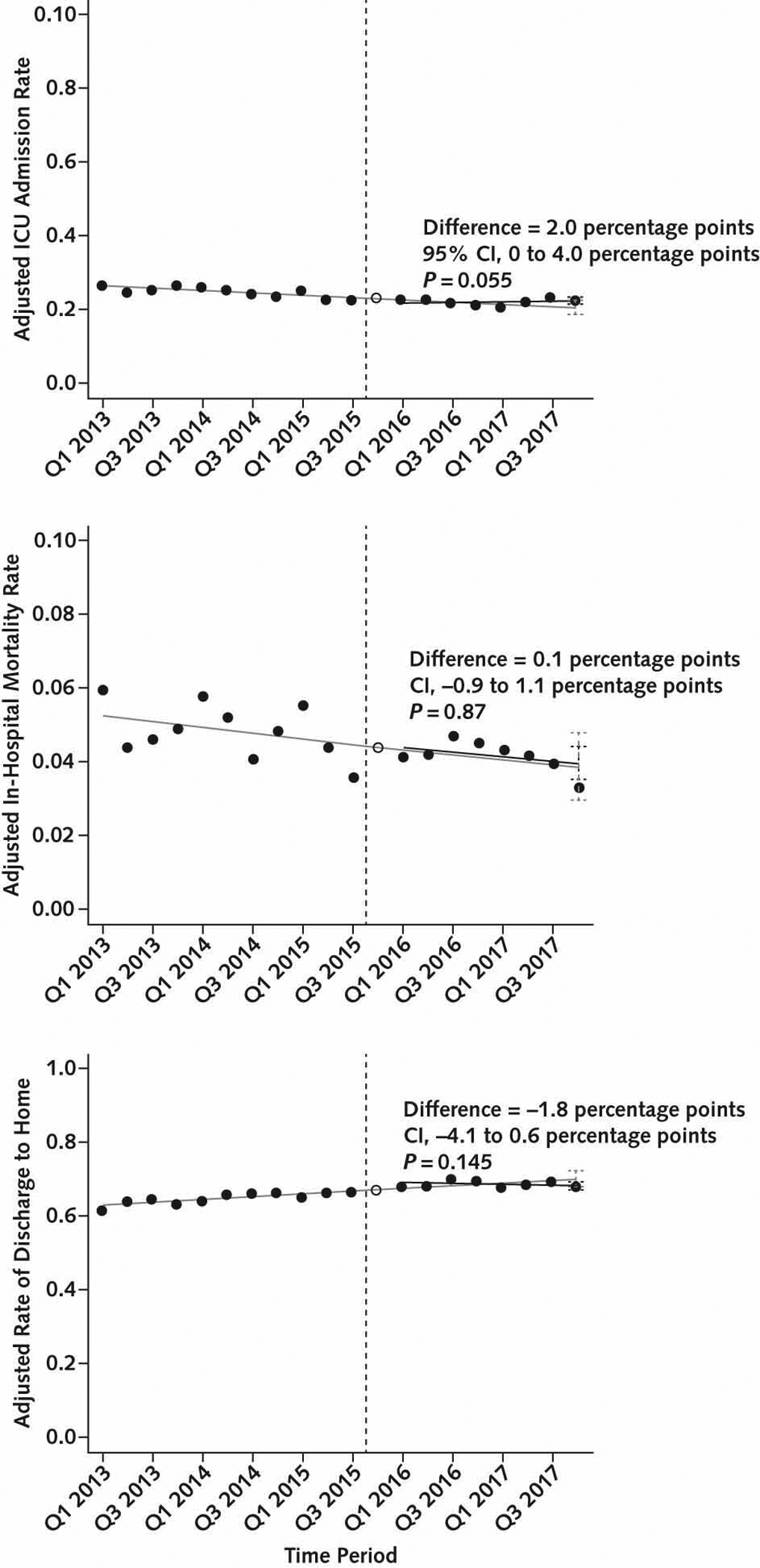
Figure 3.

Changes in risk-adjusted outcome measures in overall cohort.
The solid black circles represent risk-adjusted quarterly rates of 3 outcome measures: ICU admission (top), in-hospital mortality (middle), and discharge home among survivors (bottom). The hollow circle is the washout quarter. The vertical dashed line is the time of SEP-1 implementation in Q4 2015. The solid gray line is baseline trend without SEP-1, fitted in the baseline period and projected into the post–SEP-1 period. The solid black line is the fitted line for the trend in the post–SEP-1 period. The black vertical error bars in Q4 2017 represent 95% CIs surrounding the point estimate for the expected value of the outcome measure from the fitted line in the presence of SEP-1. The gray vertical error bars in Q4 2017 represent 95% CIs surrounding the point estimate for the expected value of the outcome measure from the fitted line in the pre-SEP-1 baseline, projected into the post–SEP-1 period. The difference between these expected values is the effect estimate for SEP-1 in Q4 2017. ICU = intensive care unit; Q = quarter; SEP-1 = Severe Sepsis and Septic Shock Early Management Bundle.
