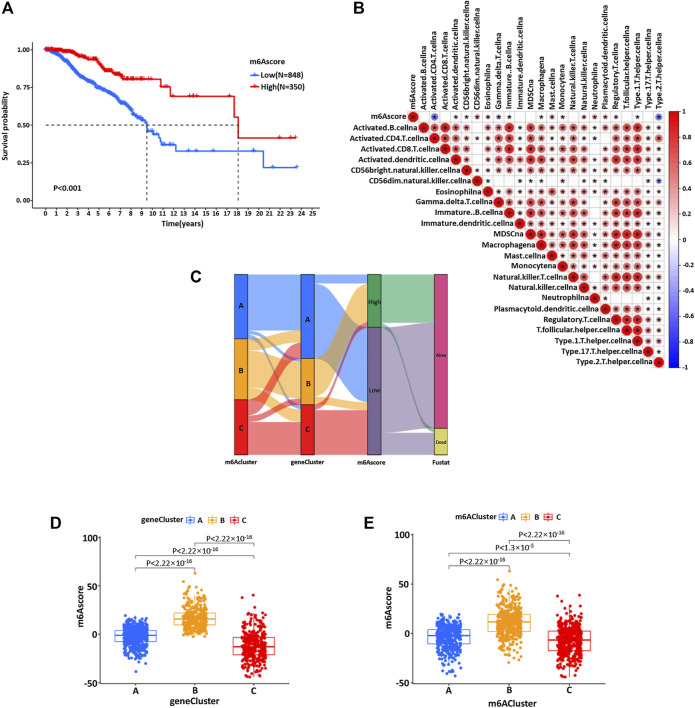
FIGURE 6.
(A) Kaplan–Meier curve was used to analyze the survival rate of the patients with high and low m6Ascores in the BC cohort (p < 0.001). (B) Spearman was used to analyze the correlation between m6Ascore and genetic characteristics in the BC cohort. Red represents positive correlation and blue represents negative correlation. (C) The alluvial map showed the changes of m6Acluster, gene cluster, m6Ascore, and survival status. (D) Kruskal–Wallis test was used to compare the statistical difference between three gene clusters in the BC cohort (p < 0.001). (E) The difference of the scores of three m6Aclusters in the BC cohort (p < 0.001, Kruskal–Wallis test).

