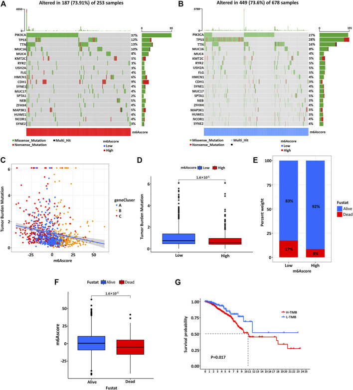
FIGURE 7.
The waterfall diagram of tumor somatic mutation in patients with high (A) and low (B) m6Ascore. Each column represents a single patient, the bar chart above represents TMB, and the number on the right shows the mutation frequency of each gene. The bar chart on the right shows the proportion of each variation type. (C) There is a significant negative correlation between the m6Ascore and TMB. (D) Quantitative analysis of TMB shows a significant negative correlation between the m6Ascore of tumors and TMB. (E) The proportion of patients with different survival statuses in low or high m6Ascore groups. (F) The difference of m6Ascore in different survival status groups. (G) Kaplan–Meier curve was used to analyze the survival of the high and low TMB load.

