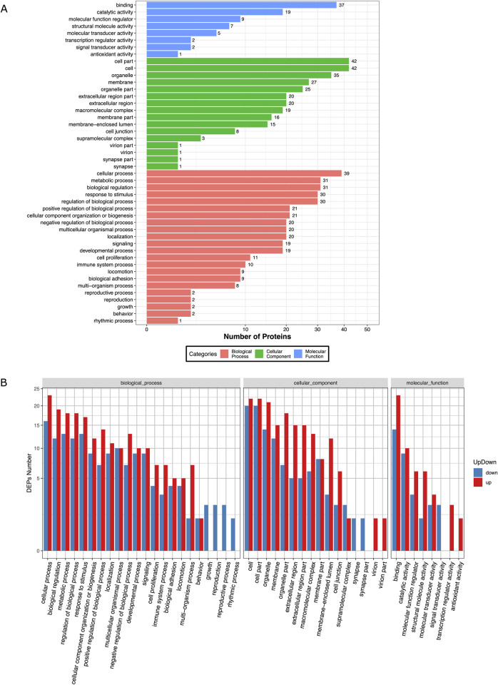
Fig 4. Bar plot showing Gene Ontology Analysis of differential expressed proteins.
a) the bar chart shows the distribution of corresponding GO terms. Different colors represent different GO categories. b) the bar chart shows corresponding GO terms based on fold change (FC) analysis of case/control ratio (see S11 Table for details).

