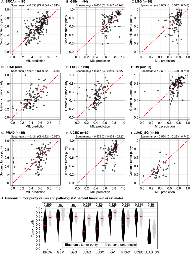
Figure 2.
The MIL model's tumor purity predictions correlate significantly with genomic tumor purity values
(A–I) A scatterplot of genomic tumor purity versus the MIL model's prediction is given for only tumor samples in the test set of each cohort: (A) BRCA, (B) GBM, (C) LGG, (D) LUAD, (E) LUSC, (F) OV, (G) PRAD, (H) UCEC, and (I) LUAD_SG. Correlation coefficients with 95% CIs are given at the top of each plot. Note that the red dotted line in each plot shows the diagonal (i.e., y = x line). All data points would align on the diagonal line in case of zero prediction error.
(J) Violin plots summarize genomic tumor purity values and pathologists' percentage tumor nuclei estimates in the test set of each cohort. Correlation coefficients are given at the top. Red lines show median values. ns, not significant; n, the number of tumor samples.

