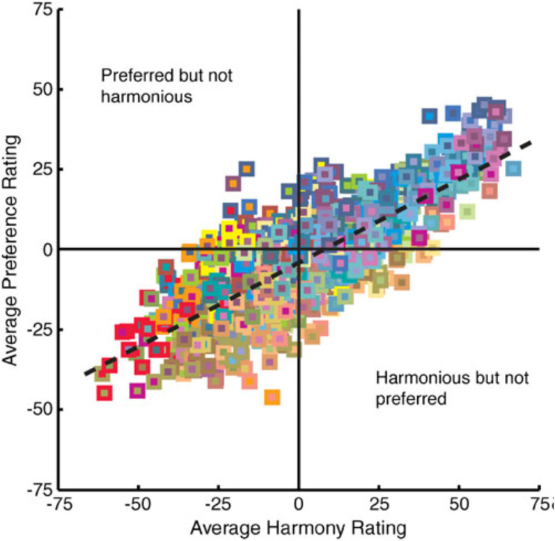
Figure 1.
Data from Schloss and Palmer (2011) highlighting the close, but by no means perfect. relationship between people's preference ratings for color pairs plotted as a function of their harmony ratings. Each of the 992 data points depicts an approximation of the figural color (small square) and ground color (large square behind the figure). The dashed line shows the best fitting regression line relating preference to harmony (y = −7.93 + 0.52x). [Figure reprinted from Schloss and Palmer (2011, Figure 8), with permission].

