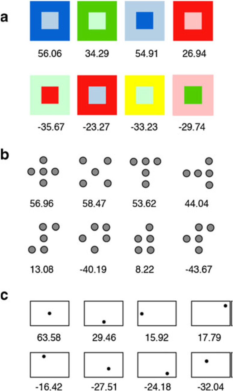
Figure 2.
Examples of the visual stimuli used in Palmer and Griscom’s (2013) study of individual differences in the preference for harmonious designs in the auditory and visual modalities: (a) color pairs, (b) dot patterns, and (c) framed-dot images. The numbers below each display indicate its average rated harmony on a scale from −100 to +100. [Figure reprinted from Palmer and Griscom (2013), Figure 1].

