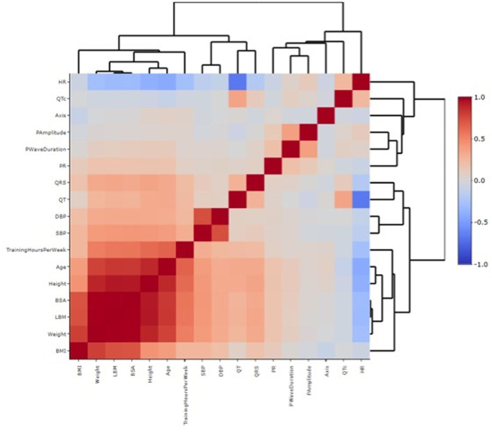
Figure 2.
Heatmap correlation between individual features and ECG variables. Each square of the heatmap represents the correlation between the x-axis and the y-axis variables, which ranges between −1 and +1. The closer to +1 the stronger the correlation is (red in the legend, high correlation). The closer to −1 there is an inverse correlation (blue in the legend). White color represents no correlation. The diagonals are all dark red because the heatmap plot is symmetrical about the diagonal and those squares represent the same variable paired together on both axes. The dendrogram highlights the different clusters in which the study population has been divided based on the different variables analyzed.

