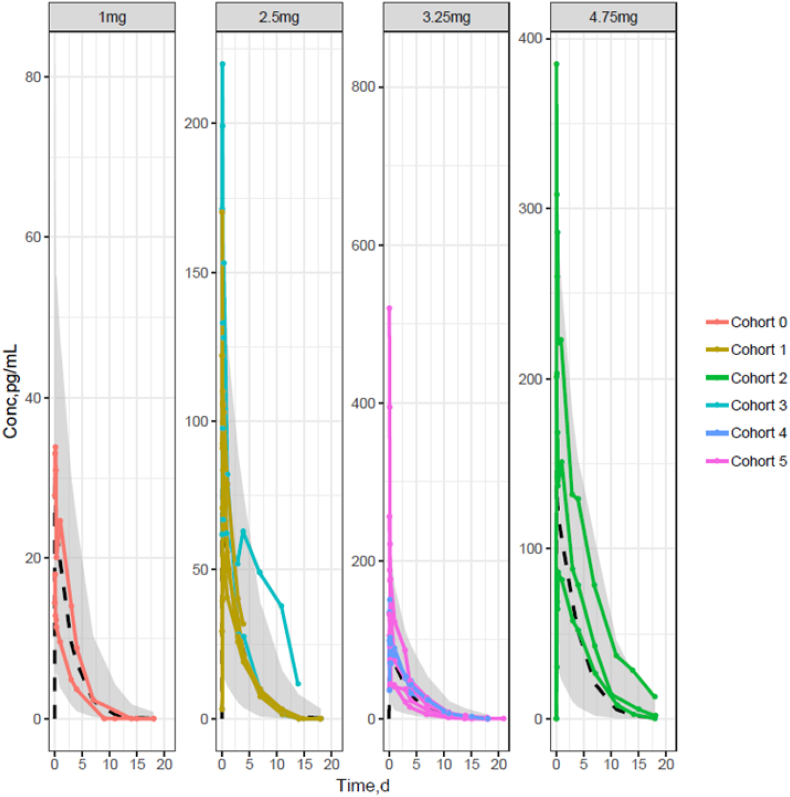
Fig. 3.
Observed individual PK profiles by dose level tested across the 6 cohorts of patients with population PK model prediction overlaid The shaded area represents the 90% prediction interval of the PK model predictions and the dashed line the median predicted exposure level for each dose. The individual PK profiles are represented by solid lines joining the dots, when PK observations were obtained.

