Fig. 2.
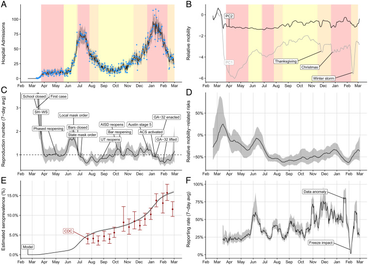
Estimated COVID-19 pandemic healthcare, mobility, and epidemiological trends in the Austin–Round Rock, TX, MSA from February 18, 2020 to February 28, 2021. (A) Median fitted (line) and observed (points) daily COVID-19 hospital admissions, with gray ribbon indicating the 95% prediction interval. (B) First two principal components derived from eight cell phone mobility variables provided by SafeGraph (19). Yellow, orange, and red shading in the top graphs indicate the timing of COVID-19 alert stages 3, 4, and 5, respectively, in the Austin MSA (46). (C) Estimated 7-d average reproduction number (Rt) with gray 95% credible band. (SI Appendix, Fig. S4 shows the full range of values early in the pandemic.) Text boxes mark key policy changes and epidemiological events (details in SI Appendix, Table S7), with the following abbreviations: SH-WS indicates the March 24, 2020 Stay Home–Work Safe order; UT indicates the University of Texas at Austin; AISD indicates Austin’s largest public school system, Austin Independent School District; ACS indicates the Alternative Care Site established in a convention center to expand healthcare capacity; and GA-32 indicates a Texas order restricting elective surgeries, bars, and restaurants according to COVID-19 healthcare usage. (D) Transmission rates relative to baseline behavior from February 19, 2020 to March 1, 2021. Our model continually estimates this relationship between mobility and transmission, since increases and decreases in precautionary behavior can change this relationship. The graph compares the estimated transmission rate at each point in time to a hypothetical transmission rate that assumes no behavioral changes (i.e., the relationship between mobility and transmission remains fixed at a value estimated prior to wide adoption of COVID-19 safety measures). A positive (negative) value indicates that the observed transmission rate was higher (lower) than would be expected if precautionary behavior had remained constant. Shading indicates 95% credible bands. (E) Comparison between our projections for SARS-CoV-2 seroprevalence (black line with gray 95% credible bands) and estimates from a Texas-wide seroprevalence survey scaled to Austin (red points with 95% CIs) (48). (F) Estimated weekly case reporting rate, with gray 95% credible band. Values correspond to the proportion of cases infected on the given day (x axis) that are eventually reported. We indicate a data anomaly, in which thousands of backlogged cases were reported on a single day, and the impact of a catastrophic winter freeze that disrupted citywide testing and reporting operations (49–51).

