
FIGURE 2.
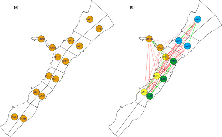
Similarity and dissimilarity between sectors in the simulated datasets: (a) randomly permuted data, where there is no population spatial structure and (b) spatially structured data, where there are four distinct clusters within the population. In (b) the simulated clusters are represented by color codes for each of their sectors (Note: CTN is part of the orange and yellow clusters). The green edges (lines) between two sectors signify that the sectors share high/low users, while red edges (lines) signify that they have opposite high/low users. The lack of an edge signifies that the high/low users of one sector do not provide information about the high/low users of other sectors