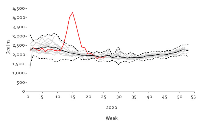
Figure 2.
All-cause mortality, Belgium, 2009–2019 and weeks 1−26 2020
Grey curves refer to the period 2009–2019, with the black curve representing the average over 2009–2019 and dashed lines representing the 99% pointwise prediction bands. The red curve refers to 2020.