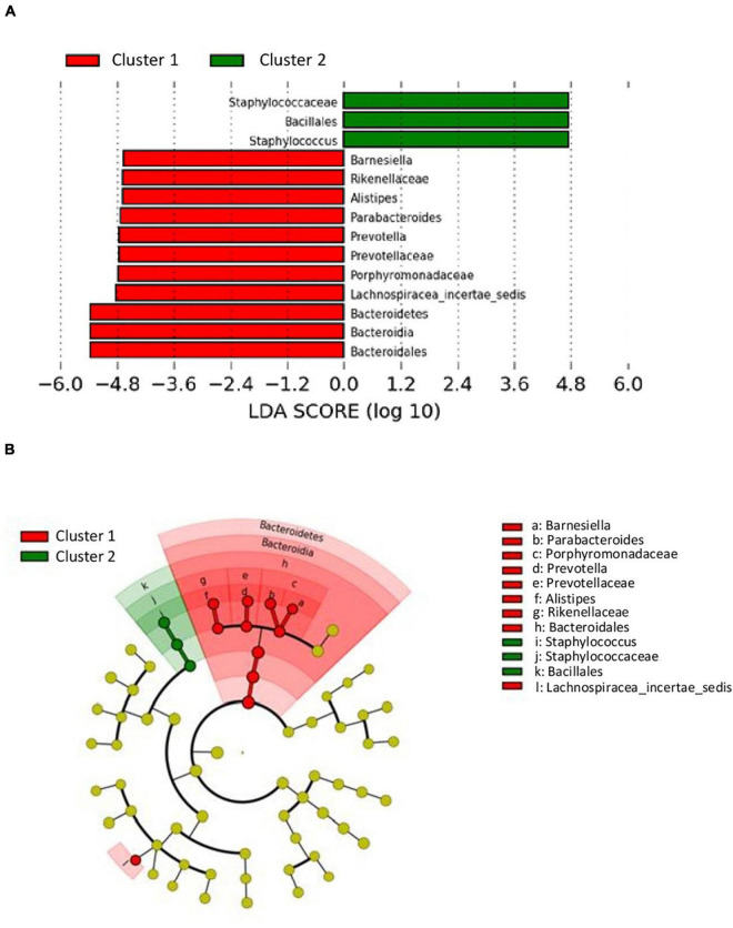
FIGURE 5.
LDA effect size (LefSe) analysis showing differences of taxa between clusters. (A) The histogram of the Linear discriminant analysis (LDA) scores illustrating the differentially abundant taxa between clusters. Horizontal bars represent the effect size for each taxon: red color indicates taxa enriched in cluster 1 group and green color indicates taxa enriched in cluster 2 group. (B) The cladogram illustrating the different taxonomic level from inside to outside that are significantly more abundant in cluster 1 group (red) and cluster 2 group (green).

