. 2022 Feb 21;130(2):027011. doi: 10.1289/EHP9324

Figure 2.

Figure 2 is a set of two line and histogram graphs titled Mortality and Hospital admissions, plotting relative risk, ranging from 0.0 to 2.5 in increments of 0.5 (left y-axis) and 0 to 100 in increments of 50 and 100 to 200 in increments of 100 (right y-axis) across 2 meter temperature (degree Celsius), ranging from 22 to 28 in unit increments (x-axis), respectively.

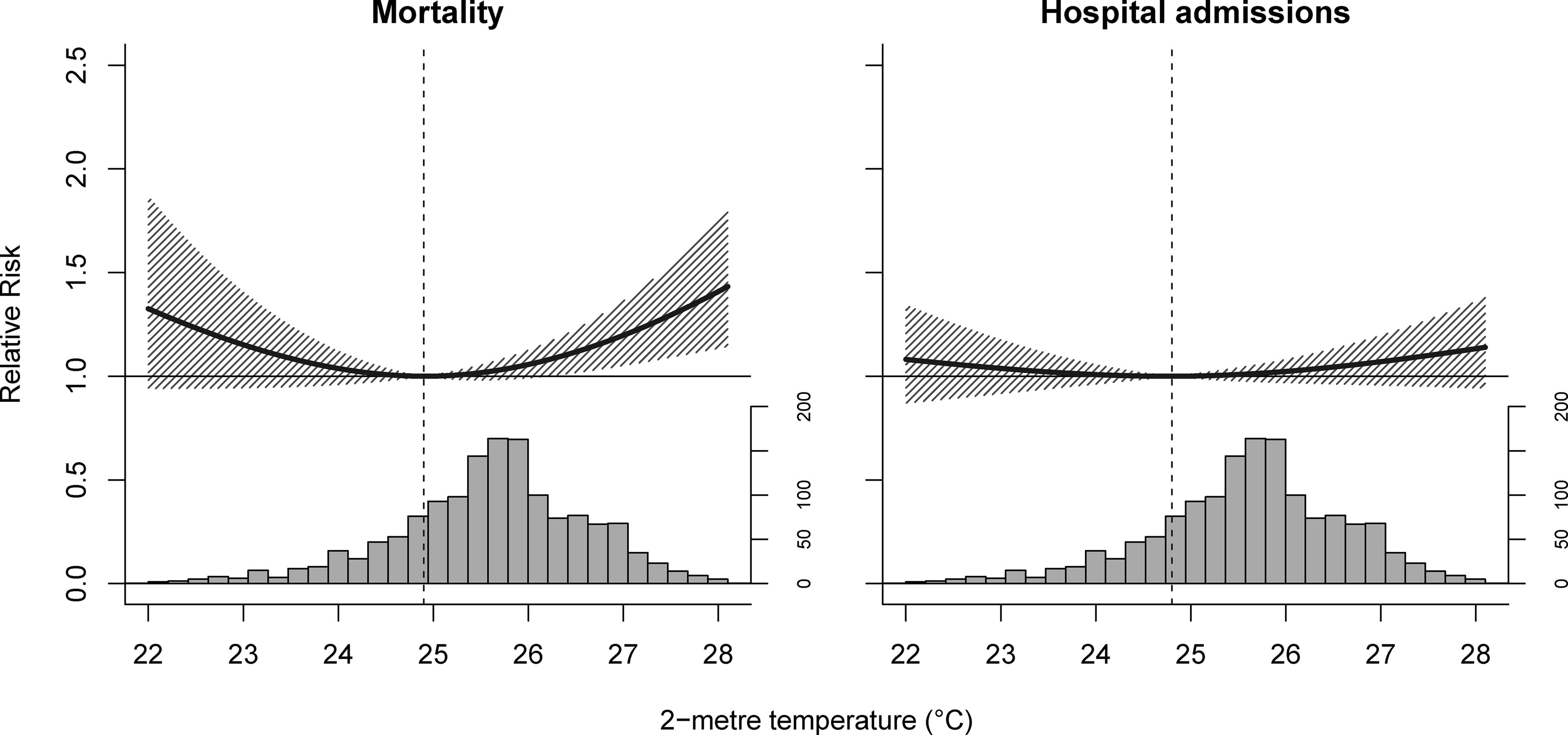
Philippines-level cumulative temperature–enteric infection associations by outcome in 2014–2017. Dashed lines are minimum risk temperatures, solid lines are relative risks, shaded regions are 95% empirical confidence intervals, and histograms the temperature distributions.