
Figure 3.
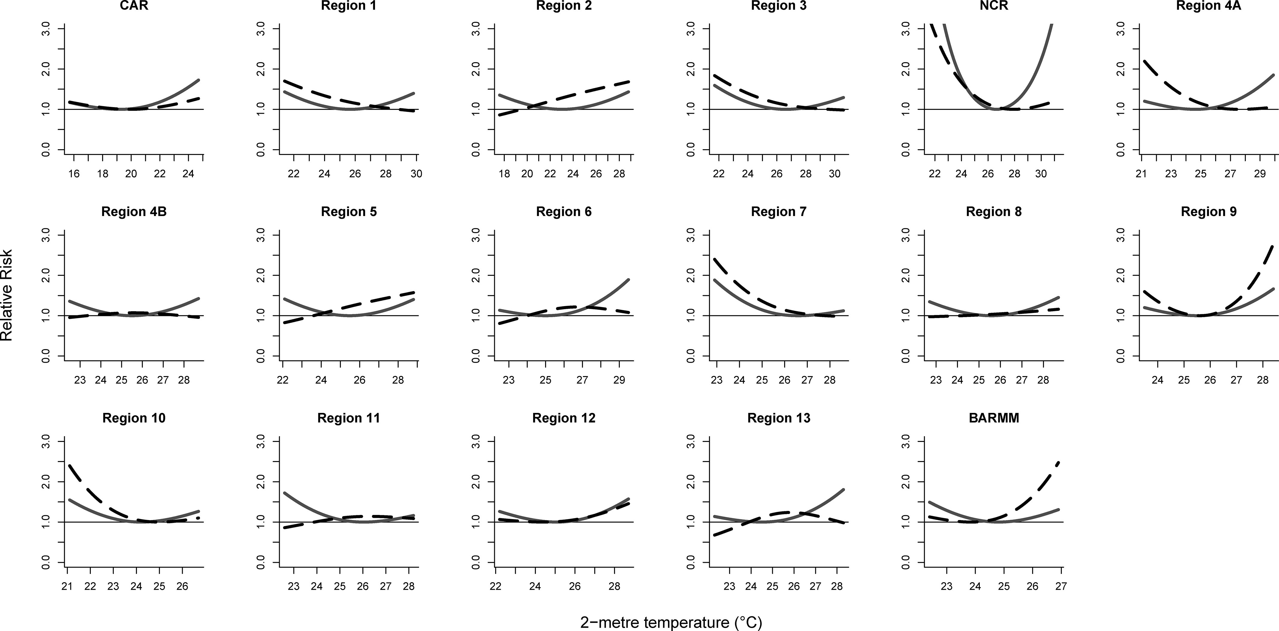
Regional cumulative temperature–enteric infection associations by outcome in 2014–2017. Solid lines are temperature–mortality associations and dashed lines are temperature–hospital admission associations.
Official websites use .gov
A
.gov website belongs to an official
government organization in the United States.
Secure .gov websites use HTTPS
A lock (
) or https:// means you've safely
connected to the .gov website. Share sensitive
information only on official, secure websites.
Regional cumulative temperature–enteric infection associations by outcome in 2014–2017. Solid lines are temperature–mortality associations and dashed lines are temperature–hospital admission associations.