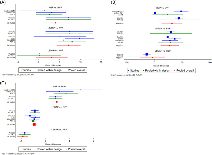
Figure 2.

Forrest plot demonstrating changes in LVEF improvement (A), changes in QRSd narrowing (B), and pacing threshold (C) between BVP, HBP, and LBBAP. Square data markers represented the MDs of the different outcomes. The horizontal lines represented the 95% CIs. BVP, biventricular pacing; CIs, confidence intervals; HBP, His bundle pacing; LBBAP, left bundle branch area pacing; LVEF, left ventricular ejection fraction; MDs, mean differences; QRSd, QRS duration
