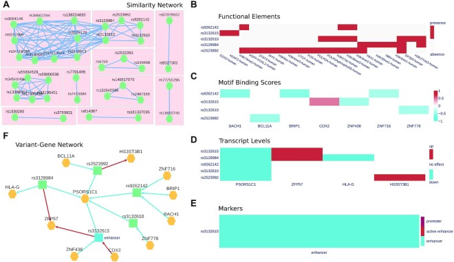
Figure 3.
Polympact web interface. (A) Polympact similarity network model built from transcript association data. Each node represents a variant and two variants are connected if and only if they have a similarity greater than zero. (B) Histone marks and transcription factor ChIP-seq peaks overlapping in the genomic region of the variant. (C) Binding motifs scores. Red annotates variants that are increasing the binding score of the motif while blue annotates variants reducing it. (D) Genotype to transcript level associations. Alternative alleles lowering the transcript level are depicted in blue while alternative alleles increasing it are depicted in red. (E) CONREL marker annotations in the genomic region of the variant. (F) Polympact variant–gene network model. Genes are coloured in yellow while variants are in blue if they are annotated as putative enhancers or in green otherwise. Edges from a variant to a gene represents an association to transcript levels and are blue if the transcript are reduced and red if transcript levels are increased. Edges from a gene to a variant represent binding motifs changes and are red if the binding score is increased and blue if it is decreased.

