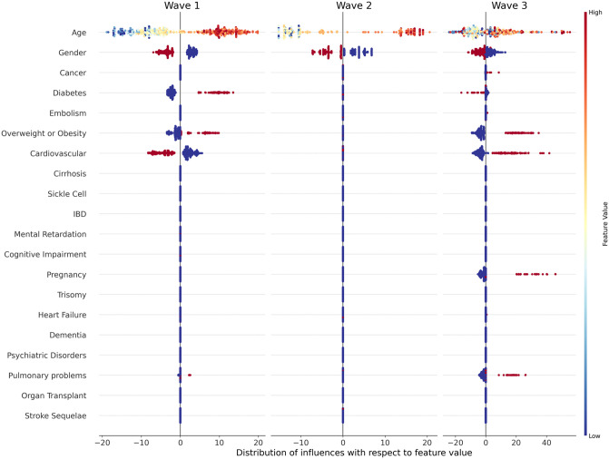
Fig 3. Distribution graph of influence with respect to feature value for each feature per wave (best viewed in color).
Each dot represents a particular patient from the dataset, with feature names on the y-axis and influence values on the x-axis. A negative influence can thus be considered as a protective factor since it decreased the probability of being in a severe state, whereas a positive influence can be considered as a risk factor. The initial value is represented by the color of the point, through the colormap indicated on the far right of the figure. A low initial value (for example a young age) is indicated by a blue point, while a high initial value (an old age) would be a red one. Gender value is 0 for men (blue dots) and 1 for women (red dots) while Comorbidity value is 0 for the absence (blue) and 1 for the presence (red).

