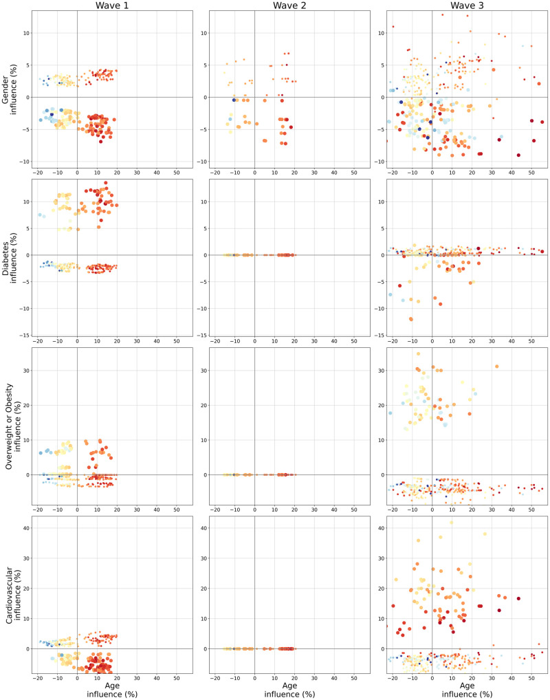
Fig 5. Bivariate graph for Age and its interaction with Gender, Diabetes, Overweight or Obesity and Cardiovascular for each wave (best viewed in color).
For each row, Age influence is on the x-axis while Gender, Diabetes, Overweight or Obesity and Cardiovascular are on the y-axis respectively for the first, second, third and fourth row. Each dot represents a particular patient. Color and size of the dot give information about the two feature initial values, respectively color for the feature located on the x-axis (here age) and size for the feature on the y-axis. The colormap for the x-axis feature is the same used in Fig 3 with blue indicating a young age and red an old age. Since the y-axis features are all binary indicators, a small point indicates a 0 (men or absence of comorbidity) and a bigger dot a 1 (women or comorbidity presence).

