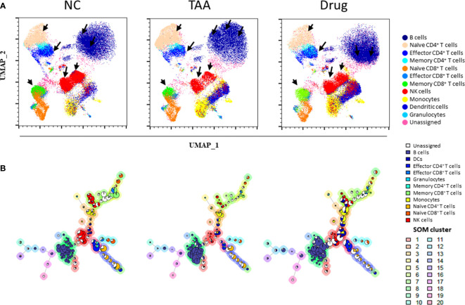
Figure 2.
Uniform manifold approximation and projection (UMAP) visualization of (A) the immune leukocytes population density between NC, TAA, and Drug groups. The arrows indicate the UMAP manually gated clusters with significant differences between the NC, TAA, and Drug groups. (B) Population pie graph of the NC, TAA, and Drug groups on FlowSOM minimum spanning trees (MSTs). The pie chart representation of population abundance aggregated with NC, TAA, and Drug groups.

