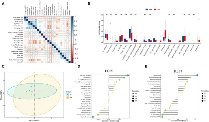
Figure 8.
Analysis of immune infiltration between the two groups and correlation analysis between EGR1, KLF4, and immune cells. (A) Correlation heatmap of 22 types of immune cells. The size of the colored squares represents the strength of the correlation. Blue represents a positive correlation and red represents a negative correlation. The darker the color, the stronger the correlation. (B) Boxplot of the proportion of 22 types of immune cells (Wilcoxon test). (C) PCA cluster plot of immune cell infiltration between AAA samples and control samples. (D,E) Correlation between EGR1, KLF4, and infiltrating immune cells. ns, not significant p > 0.05; *p < 0.05; **p < 0.01.

