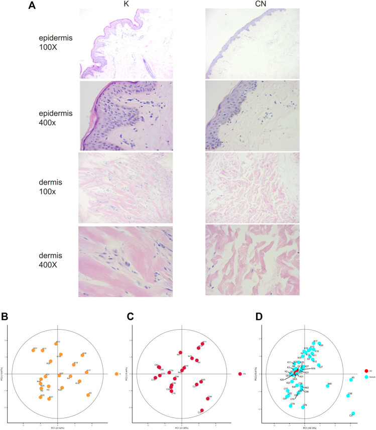
FIGURE 1.
(A) Histological images of the K group and control group, 100X. 400X. (B) Unsupervised principal component analysis (PCA) of keloid tissues. Each point in the figure represents a sample, and the position of the point in the figure is determined by all the metabolites in the sample. The ellipse in the figure is based on the 95% confidence interval calculated and drawn by Hotelling T2. The sample falling outside the ellipse implies that the point may be an outlier. (C) Unsupervised principal component analysis (PCA) of control tissues. (D) Calibration signal drift. QC sample points together, proving that the calibration effect is good. The red dots are QC samples after calibration, and the blue dots are test samples.

