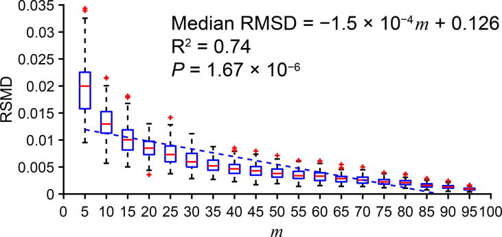
Figure 2.
A strong correlation between subcluster percentage and cluster–subcluster PGC fitness in a simulated uniformly-distributed and circular cluster
Fitness between the cluster PGC and the subcluster PGC is represented by RMSD and m indicates the percentage of expressing cells in a subcluster. In the boxplot, ‘+’ represents the data point that are beyond the 5%–95% percentile. The simulated data and source code are presented in Supplemental Data 1.

