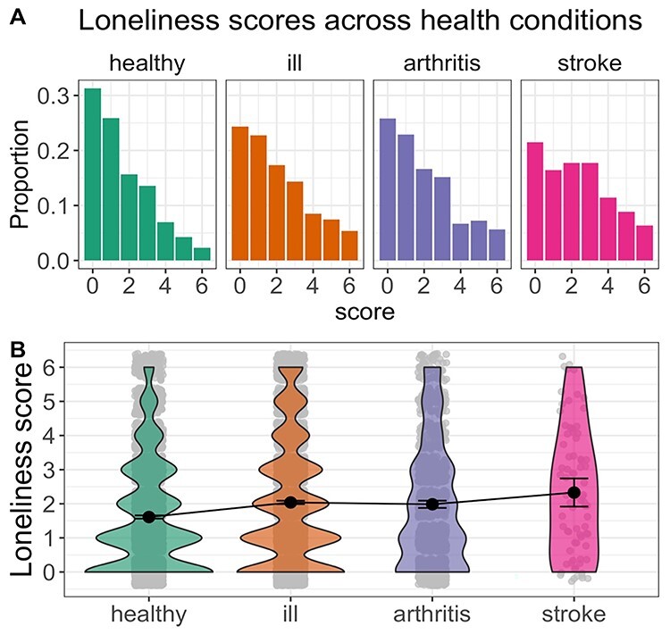
Fig. 1.

Histograms (A) and violin plots (B) of loneliness scores in Study 1. (A) Histogram representing the proportion of reported loneliness score for each health condition. (B) Violin plot representing the mean and 95% CI for each health control group in addition to the distribution of scores. Healthy = no longstanding illness; ill = any longstanding illness.
