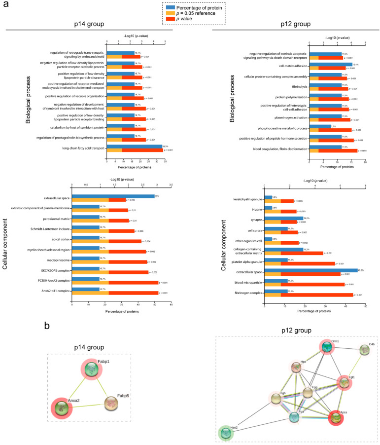
Figure 4.
Functional analysis of PLD proteome. (a) FunRich functional enrichment analysis results. Proteins identified with proteomic quantified SWATH analysis in each group, p14 (left panel) and p12 (right panel), were submitted to biological process (upper panel) and cellular component (lower panel) in FunRich software. For all graphs, upper X-axis represents −log10 (p-value) and lower X-axis represents the percentage of proteins. The highest FDR and p-value top 10 process and components are shown, which were classified according to their p-value (down the lowest p-value). (b) Protein–protein interaction map of selected clusters according to string. Proteins with significant up- and down-regulated protein abundance were submitted to string analysis. Networks represent protein–protein analysis of selected and the most important clusters of p14 (right) and p12 (left) data, respectively. Proteins are represented as nodules, which are colored red or green imply up-regulate or down-regulate in protein abundance respectively.

