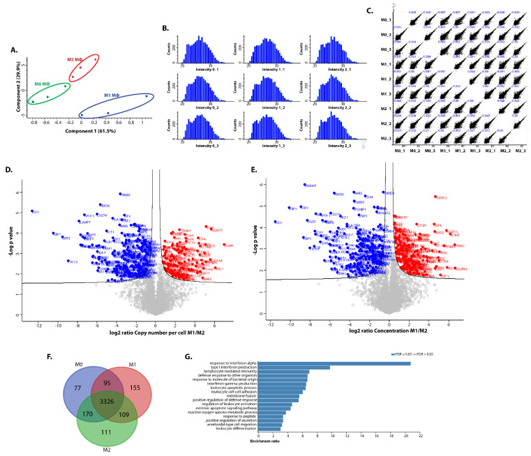
Figure 2.
Proteomic analyses of differentially polarised iPSDM. (A) Principal component analysis scores plot showing clustering of iPSDM according to their polarisation. (B) Histograms displaying the distribution of log2-transformed intensities of samples. (C) Scatter plots of protein copy numbers per cell show high correlation of biological replicates (Pearson’s coefficient close to 1). (D) Volcano plot showing fold changes in proteins using copy number vs. log p-values from mass spectrometry of M1 and M2 macrophages. (E) Volcano plot showing changes in concentrations vs. log p-values. (F) Venn diagram showing the number of proteins differentially expressed by polarised iPSDM. (G) Gene ontology analysis of the protein hits enriched in M1 iPSDM.

